|
Oxford Dictionary: Colour /ˈkʌlə/ (mass noun),
"The property possessed by an object of
producing different sensations on the eye as a result
of the way it reflects or emits light.
1.1 (count noun) One, or any mixture, of the constituents
into which light can be separated in a spectrum or rainbow,
sometimes including (loosely) black and white.
Origin: Middle English: from Old French colour (noun), colourer (verb), from Latin color (noun), colorare (verb).."
Color theories first appeared in writings by
Leone Battista Alberti(c.1435) and in the notebooks of
Leonardo da Vinci (c.1490), and by
Isaac Newton in 1704.
|
DISPERSION AND REFRACTION
|

|
|
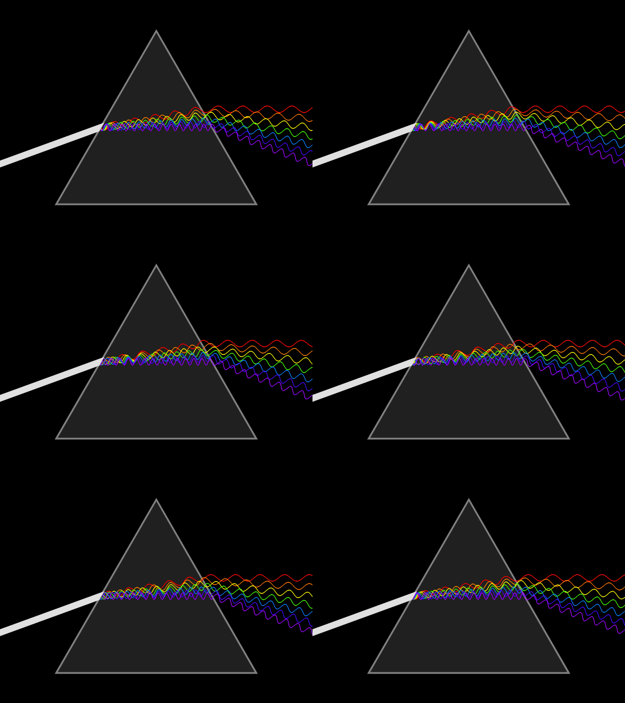
The white beam represents many wavelengths of visible light, of which seven are shown,
as they travel through a vacuum with equal speeds
c. The prism causes the light to slow down,
which bends its path by the process of refraction.
This effect occurs more strongly in the
shorter wavelengths (violet end) than in the
longer wavelengths (red end), thereby
dispersing the constituents.
As exiting the prism, each component returns to the
same original speed and is
refracted again.
Explanation and Source
|
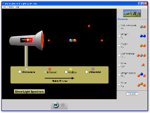
MOLECULES AND LIGHT
Do you ever wonder how a greenhouse gas affects the climate,
or why the ozone layer is important?
Use the sim to explore how light interacts
with molecules in our atmosphere.
phet.colorado.edu
|
BENDING LIGHT
Explore bending of light between two media
with different indices of refraction.
See how changing from air to water to
glass changes the bending angle.
Play with prisms of different shapes and make rainbows.
phet.colorado.edu
|
CYTOLOGY | HOW THE EYES SEE COLOR
Focusing light onto the
retina (30) causes chemical changes in the photosensitive cells that
trigger nerve impulses which travel to the brain. Maximize and watch the video:
A Journey Through the Human Eye: How We See (Index: center column)
The retina (30) contains two forms of photosensitive cells important to vision�rods and cones.
Though structurally and metabolically similar, their function is quite different. Refer to video playlist above:
Anatomy and Function of the Eye,
Visual Information Processing, and
How We See Color.
-
Rod cells are highly sensitive to light allowing them to respond in dim light and dark
conditions, however, they cannot detect color. These are the cells which allow humans
and other animals to see by moonlight, or with very little available light (as in a dark room).
This is why the darker conditions become, the less color objects seem to have.
-
Cone cells, conversely, need high light intensities to respond and have high visual acuity.
Different cone cells respond to different wavelengths of light, which allows an organism
to see color.
The
fovea (26), directly behind the lens, is a dip in the retina directly opposite the lens and
consists of mostly densely-packed cone cells. It is largely responsible for color vision in humans,
and enables high acuity (detailed central vision), such as is necessary in reading
or any other task which primarily requires looking at things. More references
|
COLOR VISION
Make a whole rainbow by mixing red, green, and blue light.
Change the wavelength of a monochromatic beam or filter white light.
View the light as a solid beam, or see the individual photons.
phet.colorado.edu/en/simulations/color-vision
|
ADDITIVE COLOR THEORY | "Projected" light | R G B
- This is color based upon light, it does not apply to printing.
Your computer monitor and television use RGB.
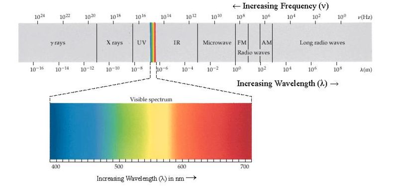
White light is a combination of many different colors, a continuum of wavelengths
organized into "bands" which we label with names (blue, green, red etc).
When equal parts of each of the three major bands are combined you get white light.
White light is the sum of red, green and blue.
-
RGB |
red,
green, and
blue
are the "primary colors" in which all other colors are
derived from.
RGB Color Space
|


|
Our favorite tool teaching "projected" RGB light
|
|

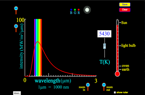
BLACKBODY SPECTRUM
How does the blackbody spectrum of the sun compare to visible light?
Learn about the blackbody spectrum of the sun, a light bulb, an oven, and the earth.
Adjust the temperature to see the wavelength and intensity of the spectrum change.
View the color of the peak of the spectral curve.
phet.colorado.edu

|
COLOR SCHEMES
Colors nearest the center or the poles are most achromatic.
Colors of the same lightness and saturation are of the same nuance.
Colors of the same hue and saturation, but of different lightness, are said to be tints and shades.
Colors of the same hue and lightness, but of varying saturation, are called tones."
|
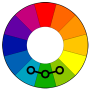
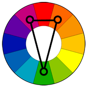
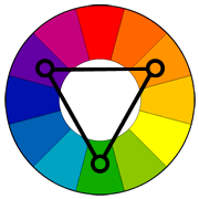
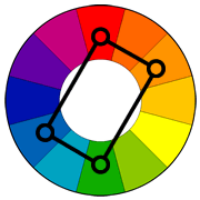
 Analogous |
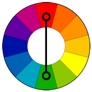
 Contrast |
 Split |
 Triad |
 Tetrad |
 Achromatic |
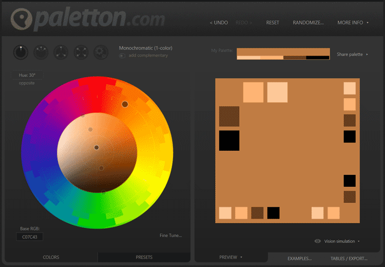
 Monochromatic |
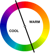
 Temp |
 Hexidecimal |
 Nature |
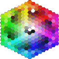
The above interactive illustration shows the color circle with the primary, secondary
and tertiary colors.
Click on the labels to turn the colors on / off.
Source:canva.com
COLOR THEORIES
Color theory is a body of practical guidance to color mixing and the visual
impact of specific color combinations.
More references
SUBTRACTIVE COLOR THEORY | R Y B
Subtractive color explains the theory of
mixing paints, dyes, inks, and natural colorants
to create colors which absorb some wavelengths of light and reflect others.
The color that an opaque object appears to have is based on
what parts of the electromagnetic spectrum are reflected by it,
or conversely by what parts of the spectrum are not absorbed.
It is also called the "reflective" color theory. There are:
-
Primary or "primitive" colors:
red, yellow and blue
(RYB) -- because these colors were believed capable of mixing all other colors.
-
Secondary colors are the three colors that are equal distant from the primary colors.
On the traditional artist's color wheel violet, green, and orange are secondary colors.
They are created from mixing two primaries.
-
Tertiary colors are the colors between each primary and secondary color.
On the traditional artist's color wheel red-violet, blue-violet, blue-green, yellow-green, yellow-orange, and red-orange are tertiary colors.
They are created from mixing one primariy and a secondary.
|


|
SUBTRACTIVE COLOR TEMPERATURE
- Visually, warm colors advance, cool colors recede.
- Measured in Kelvins, ironically the hottest radiating bodies have a cool color
while the less hot bodies radiate with a warm color.
|

|
TINTS AND SHADES
- Adding White to a pure hue is called a "tint"
- Adding black to a pure hue is called a "shade"
- Adding gray to a pure hue is called a "tone"
|

|
COLOR SPACE AND MODELS
Adding a certain mapping function between the color model and a certain reference color space results in a
definite "footprint" within the reference color space. This "footprint" is known as a gamut, and,
in combination with the color model, defines a new color space. For example, Adobe RGB and sRGB
are two different absolute color spaces, both based on the RGB model.
In the most generic sense of the definition above, color spaces can be defined without the use of a color model.
These spaces, such as Pantone, are in effect a given set of names or numbers which are defined by the existence
of a corresponding set of physical color swatches. This focuses on the mathematical model concept.
A color model is an abstract mathematical model describing the way colors can be represented
as tuples of numbers, typically as three or four values or color components
(e.g. RGB and CMYK are color models). However, a color model with no associated mapping function
to an absolute color space is a more or less arbitrary color system with little
connection to the requirements of any given application.
|

|
MUNSELL COLOR SYSTEM
- The Munsell color system, in colorimetry, the is a color space that specifies colors based on three color
dimensions, hue, value (or lightness), and chroma (roughly saturation).
It was created by Professor Albert H. Munsell in the first decade of the 20th century.
- Several earlier color order systems had placed colors into a three dimensional color solid
of one form or another, but Munsell was the first to separate hue, value, and chroma into
perceptually uniform and independent dimensions, and was the first to systematically illustrate
the colors in three dimensional space.
- Munsell's system, and particularly the later renotations, is based on rigorous measurements of
human subjects� visual responses to color, putting it on a firm experimental scientific basis.
Because of this basis in human visual perception, Munsell�s system has outlasted its contemporary color models,
and though it has been superseded for some uses by models such as CIE L*a*b* and CIECAM02,
it is still in wide use today.
|


|
CIE L*a*b* Color Space
- C I E L*a*b* - Unlike the RGB and CMYK color models, Lab color is designed to approximate human vision.
It aspires to perceptual uniformity, and its L component closely matches human perception of lightness.
It can thus be used to make accurate color balance corrections by modifying output curves in the a and b
components, or to adjust the lightness contrast using the L component.
These transformations are difficult or impossible in the RGB or CYMK spaces,
which model the output of physical devices, rather than human visual perception.
- Because Lab space is much larger than the gamut of computer displays, printers, or even human vision,
a bitmap image represented as Lab requires more data per pixel to obtain the same precision as an RGB
or CMYK bitmap.
- In the 1990s, when computer hardware and software was mostly limited to storing and manipulating 8 bit/channel bitmaps,
converting an RGB image to Lab and back was a lossy operation. With 16 bit/channel support now common, this is no longer such a problem.
|

|
RGB COLOR SPACE
-
RGB
Red,
Green,
Blue
is color based upon light. They are the three primaries (with green replacing yellow).
Your computer monitor and television use R G B.
- By combining these 3 colors, any other color can be produced.
- Remember, this color method is only used with light sources; it does not apply to printing.
|


|
CMYK COLOR MODEL
-
C M Y K Color Model This is the color method based upon pigments. (Also called "process colors")
C
M
Y
K stands for
Cyan,
Magenta,
Yellow, and
Black
Most other colors can be achieved by mixing these four colors
Unfortunately, C M Y K cannot reproduce the same amount of colors as R G B can, which is why yellow-greens sometimes look a bit muddy
when printed. This is the method used by printers the world over, and is also a clever way of mixing paints.
- Ideal image setting for your document
|

|
PMS | PANTONE MATCHING SYSTEM
-
Pantone Matching System - Identified by code to guarantee the exact color
-
P M S | Pantone Matching System is a large list of specially mixed colors made by the Pantone Corporation.
Instead of using CMYK to create colors, the pigments are created individually for purity.
For example, if you wanted to use a Red-Violet color, you'd pick PMS 233M.
The color would be made exclusively for your project and would always print exactly how you want.
The only drawback to using PMS colors is that they're only useful for projects with few colors.
They're also more expensive.
|

|
HEXIDECIMAL COLOR SPACE
|

|
COLOR SYMBOLISM | PSYCHOLOGY
- Color symbolism refers to the use of color as a symbol throughout cultures and religions.
Color psychology is a field of psychology devoted to analyzing the effect of color
on human behavior and feeling. For example, symbolically, red may be used to denote danger,
largely due to the fact that reds have the illusion of appearing nearer than other colors
and, therefore have greater impact. In color psychology, on the other hand the colors of danger are yellow and black.
In color symbolism, green denotes envy in many cultures, while in color psychology, it is associated with balance.
- Referencing colors with emotions is
developed by every individual when they feel an emotion and then dee a color repeated during
this time. After the connection is ingrained, the referencing can go both ways.
Various cultures see color differently. Most evidence suggest primarily the lack of a single,
universal psychological reaction to a particular color.
|

|
COLOR DIFFERENCES? MONITORS VS. PRINTING INKS
Primary colors used in the printing process are not capable of displaying the range of colors
that exists in light; therefore it is extremely difficult to emulate screen colors on paper.
- The most important problem has been a confusion between the behavior of light mixtures, called additive color mixing,
and the behavior of paint or ink (or dye or pigment) mixtures, called subtractive color mixing. This problem arises
because the absorption of light by material substances follows different rules from the perception of light by the eye.
- A second problem has been the failure to describe the very important effects of strong luminance (lightness) contrasts
in the appearance of surface colors (such as paints or inks) as opposed to light colors; "colors" such as grays, browns or
ochres cannot appear in light mixtures. Thus, a strong lightness contrast between a mid valued yellow paint and a
surrounding bright white makes the yellow appear to be green or brown, while a strong brightness contrast between
a rainbow and the surrounding sky makes the yellow in a rainbow appear to be a fainter yellow or white.
- A third problem has been the tendency to describe color effects holistically or categorically, for example
as a contrast between "yellow" and "blue" conceived as generic colors, when most color effects are due to contrasts
on three relative attributes that define all colors: lightness (light vs. dark, or white vs. black), saturation
(intense vs. dull) and hue (e.g., red, yellow, green, blue or purple). Thus, the visual impact of "yellow" vs.
"blue" hues in visual design depends on the relative lightness and intensity of the hues.
 Calibrated Monitor |
 Red value off |
 Green value off |
 Blue value off |
|


|
|
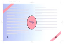
If your finished piece will be 2 or more colors, overprinting or close registration, save your files to include:
- Page information
- Crop marks/registration marks
- Color separations
- If you have bleeds: extend your bleed area outside of the cropmarks.
- This will ensure a true bleed when we cut your finished piece
|
Composite file in color:The finished project in Black, Blue and Red inks. |
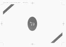
Separated file:This separation represents the Red ink. |
 |
 |
Separated file:This separation represents the Black ink. |
Separated file:This separation represents the Blue ink. |
 |
 |
Color separated PDF’s: include crop marks, turn off compression, and embed all fonts and images used in the document. |
|
