
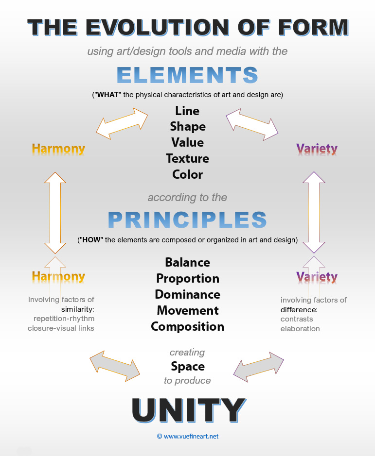
The Elements & Principles of art and design are the building blocks of an artwork's composition. Knowing and understanding them allows us to analyze and evaluate creative work from a theoretical perspective. The terms and/or subcategories vary from resource to resource. Here, you will learn a broad scope of information that includes additional resources for advanced investigation.
describe "WHAT"
the physical characteristics of art and design are.
(intrapage links to subjects below)
Line: Hatching+, Stippling, Blending+
Shape: Organic, Geometric, Open, ClosedValue: Spectrum Scale, Keys, Lighting+
Texture: Tactile, Implied, Rubbings+
Color: Science, Schemes, Psychology+
Space: Linear & Aerial Perspective, Grids+
Form: Volume
describe "HOW"
the elements of art and design work together.
(intrapage links to subjects below)
Balance: Symmetry, Asymmetry, Radial+
Proportion: Scale, Measurement+
Dominance: Emphasis, Hierarchy+
Harmony, Variety: Same, Different+
Movement: Rhythm, Repetiton, Patterns
Unity: Composition, Golden Ratio+
Cover Video & Timestamps: Line: 7 Elements of Art
(7:24) │
Learn from artist Lillian Gray about Line Quality, Various Types of Line, Lines used in Shading and Mark Making.
She also looks at the use of lines in famous artworks.
│ Lillian Gray
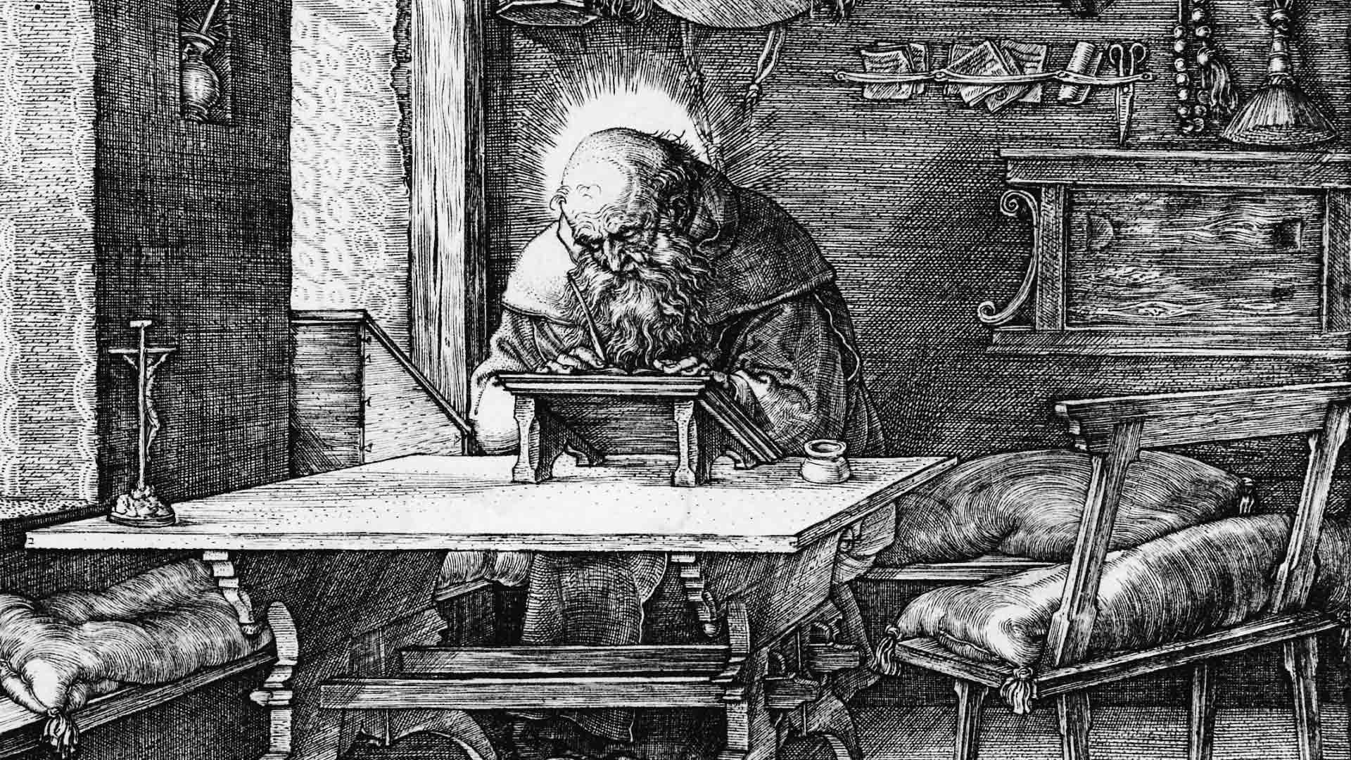
St. Jerome in His Study │ engraving detail, c.1514, by Albrecht Durer, Saint Jerome in His Study, Metropolitan Museum of Art, New York, USA. Saint Jerome, translator of the Bible, works peacefully at a slanted writing table, and his lion and dog slumber equally peacefully in the foreground. The light of his halo and the sunlight pouring in through the windows are in perfect equilibrium, and recurrent horizontals in the composition add to the pervasive sense of repose and harmony.
Video: SHAPE: The 7 Elements of Art (12:39)
Shape is one of the seven elements of art, along with line, value, texture, colour, space and form. │ Lillian Gray
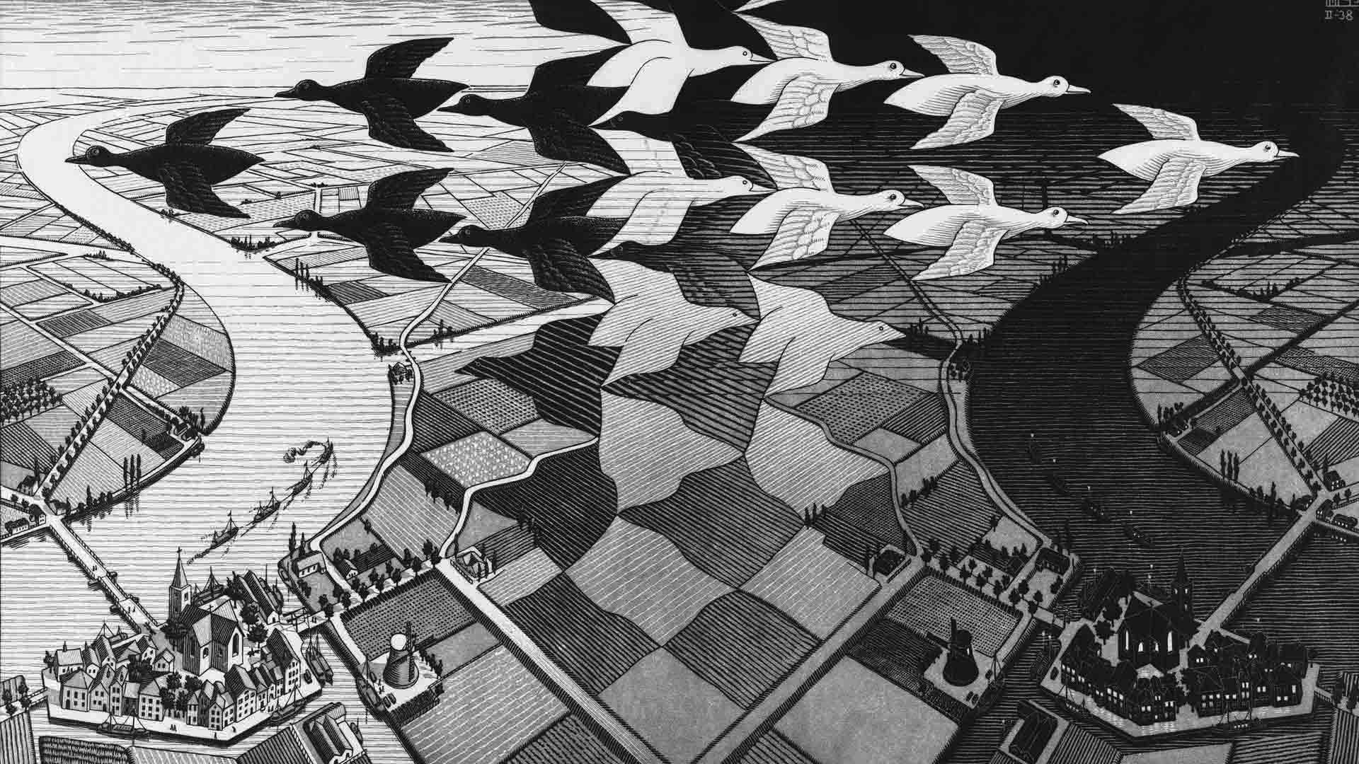
Video: M.C. Escher, Day and Night, 1938 | The Amazing World of M.C. Escher │ M.C. Escher's unique take on Dutch landscape, melting reality through tessellations. —Dulwich Picture Gallery
Video: Line: 7 Elements of Art
(7:24) │
Learn from artist Lillian Gray about Line Quality, Various Types of Line, Lines used in Shading and Mark Making.
She also looks at the use of lines in famous artworks.
│ Lillian Gray
Texture: Element of Visual Art and Design │ n the visual arts, texture is the perceived surface quality of a work of art. It is an element of two-dimensional and three-dimensional designs and is distinguished by its perceived visual and physical properties. Use of texture, along with other elements of design, can convey a variety of messages and emotions... Wikipedia
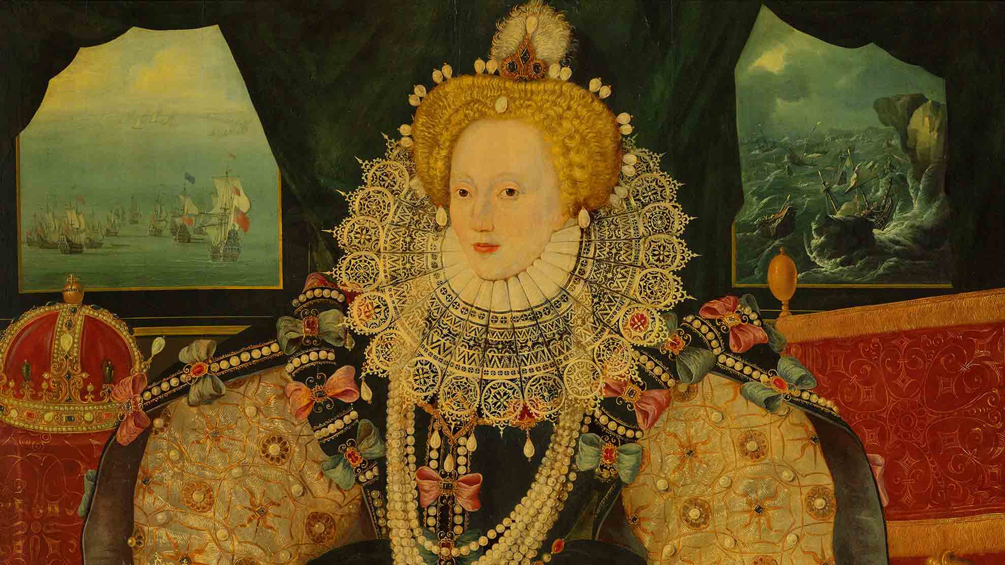
Practice: As seen in the previous lesson, "What is Art?" hover over the color wave image below to see the detail of: Queen Elizabeth I, The Armada Portrait, and mentally describe (or discuss) the elements used thus far. What is the main color scheme used by this artist?
Color: Element of Visual Art and Design │ Color is the result of light reflecting back from an object to our eyes. The color that our eyes perceive is determined by the pigment of the object itself. Color theory and the color wheel are often referred to when studying colour combinations in visual design. Con't... Wikipedia
Color is light reflected off of objects. Color has three main characteristics: hue (the name of the color, such as red, green, blue, etc.), value (how light or dark it is), and intensity (how bright or dull it is). "In physics, colour is associated specifically with electromagnetic radiation of a certain range of wavelengths visible to the human eye. Radiation of such wavelengths constitutes that portion of the electromagnetic spectrum known as the visible spectrum—i.e., light." Con't... Britannica (Video Demonstrations and Images)
Video: Elements of Art: Space │
Space is the area between and around objects.
The space around objects is often called negative space;
negative space has shape.
Space can also refer to the feeling of depth.
Real space is three-dimensional; in visual art, when we create
the feeling or illusion of depth, we call it space.
During the Renaissance, artists became preoccupied with
new ways of capturing reality such as the use of
linear perspective, and the realism possible through the use of illusory techniques.
Discover the techniques that artists use to control and manipulate space in their work.
1
2
3
4
5
6
7

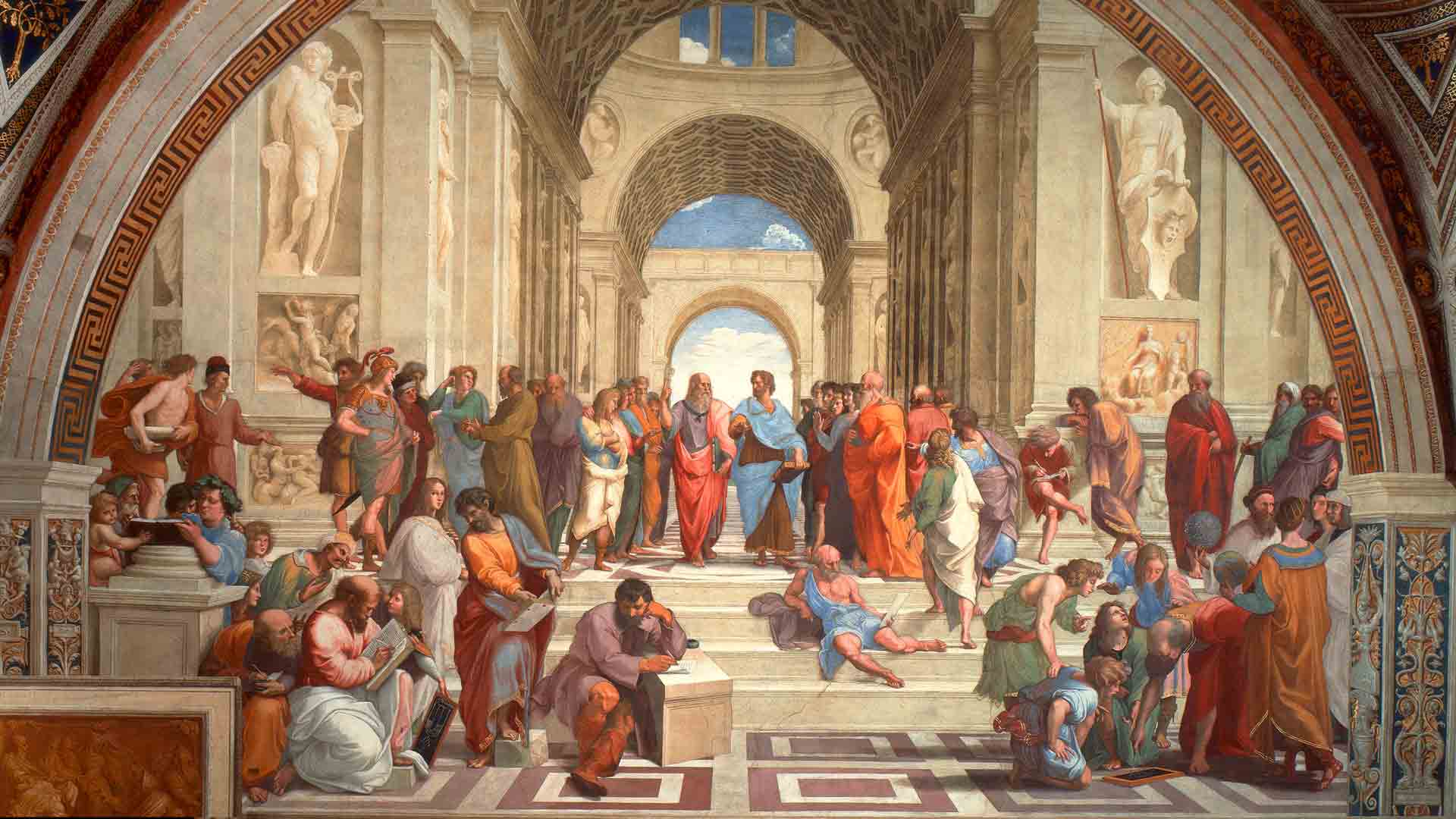
The School of Athens │ fresco detail, 1509–1511, by Raphael, Vatican Museums, Rome, Italy. As we briefly mentioned this painting's signifigance during the Renassaince, with the union of minds having profound impacts on civilization, in the video below, we will take a look at the physical properties of space— the area between and around objects.
Video Above: Form: 7 Elements of Art
(11:45) │
Form is one of the seven elements of art, along with line, value, texture, colour, space, and shape.
│ Lillian Gray
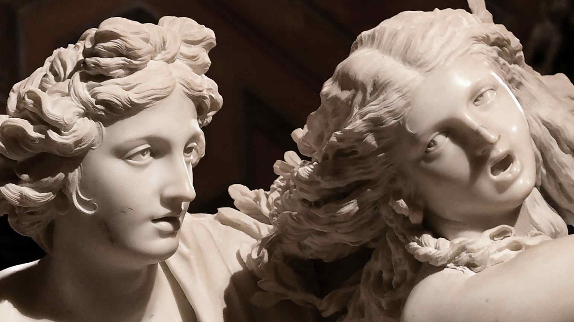
Apollo and Daphne │ two marble scupture details, c.1622-25, by Gian Lorenzo Bernini, Galleria Borghese, Rome, Italy. As you recall, we mentioned form and other elements as a way to capture facial expressions and body language to refflect emotions in the meanings of art. We will discuss this painting in detail when we disscuss the Baroque period in art history.
The Principles of Design describe "how" the elements are put together in art: (bookmarks)
Video : Balance - Art Vocab Definition (0:33) -Phil Hansen
Balance (Principle of Art and Design) is the even (though not necessarily equal) distribution of the design elements to create harmony within a composition. -Visual Communication Design
There are three types of balance in visual design:
Symmetrical, Asymmetrical, and Radial Balance.
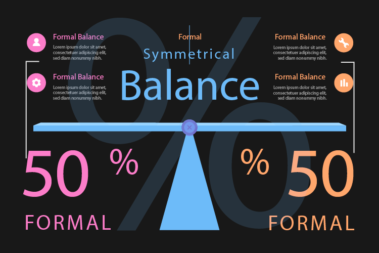
Symmetrical or Formal Balance: Imagine placing an imaginary line down the middle of a composition. If the elements are of equal weight and value on either side we refer to this as symmetrically balanced. Usually when one or more elements are mirrored on either side we refer to this as a stable or more formal composition. Symmetrical Balance adds a sense of order, rest, & calmness to a composition.
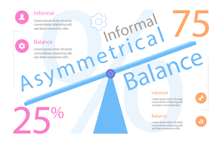
Asymmetrical or Informal Balance: When the imagery is not mirrored we can describe the composition as being dynamic or informal. If the elements are not mirrored this is referred to as asymmetrically balanced. Asymmetrical balance adds a sense of tension, dynamics, and emphasis to a composition. The overall effect is a strong, dynamic and effective composition.
Radial Balance is arranged around a central element.
The elements placed in a radial balance
seem to 'radiate' out/in from/to
a central point in a circular fashion.
Centripetal (adjective)
1.: proceeding or acting in a direction toward a center or axis -Merriam-Webster Dictionary
Centrifugal (adjective)
1. : proceeding or acting in a direction away from a center or axis
centrifugal acceleration of a body -Merriam-Webster Dictionary

Principles: Scale / Proportion │ Using the relative size of elements against each other can attract attention to a focal point. When elements are designed larger than life, scale is being used to show drama...-Wikipedia
Video Below: Measuring Methods For Artists (2:53) │ Artists often use measuring techniques to achieve more accurate, realistic effects. Measuring is used to calculate relative sizes and proportions and is useful for still lifes, landscapes and even figurative art. Today we use several measuring methods including: comparative, sight-size and triangulation." —CroquisCafe
Principles: Dominance / Emphasis │ Dominance is created by contrasting size, positioning, color, style, or shape. The focal point should dominate the design with scale and contrast without sacrificing the unity of the whole...-Wikipedia
Hierarchy; a good design contains elements that lead the reader through each element in order of its significance. The type and images should be expressed starting from most important to the least important...-Wikipedia
Video Below: How to Create Focal Points in Art │ (2:02) Learn 5 ways to create focal points in your artwork Composition. Art. Drawing and Painting. —The Virtual Instructor
Principle: Harmony (or Similarity) │ Planning a consistent and similar design is an important aspect of a designer's work to make their focal point visible. Too much similarity is boring but without similarity important elements will not exist and an image without contrast is uneventful, so the key is to find the balance between similarity and contrast...-Wikipedia
Principle: Variety (or Contrast)
the state of being strikingly different from something else
in juxtaposition or close association...-Wikipedia
Video Above: Variety - Art Vocab Definition │
(0:33) Phil Hansen
Principle: Movement │ is the path the viewer’s eye takes through the work of art, often to focal areas. Such movement can be directed along lines, edges, shape, and color within the work of art..-Getty (pdf)
Movement subcategories include: pattern, repetition and rythm below:
Pattern │ Many textures appear to repeat the same motif. When a motif is repeated over and over again in a surface, it results in a pattern...-Wikipedia
Repetition │ works with pattern to make the work of art seem active. The repetition of elements of design creates unity within the work of art...-Getty
Rhythm │ is created when one or more elements of design are used repeatedly to create a feeling of organized movement. Rhythm creates a mood like music or dancing. To keep rhythm exciting and active, variety is essential...-Getty
Video Below: Visual Movement - Art Vocab Definition │ (0:22) Phil Hansen
Principle: Golden Ratio │ When all elements are in agreement, a design is considered unified. No individual part is viewed as more important than the whole design. A good balance between unity and variety must be established to avoid a chaotic or a lifeless design...-Wikipedia
Video Below: Design Principles - Golden Ratio │ (20.31) VirtualAddiction
Principle: Composition │ In the visual arts, composition is the placement or arrangement of visual elements or 'ingredients' in a work of art, as distinct from the subject. It can also be thought of as the organization of the elements of art according to the principles of art...-Wikipedia
Video Below: Composition - Art Vocab Definition │ (0:24) Phil Hansen
Principle: Unity │ When all elements are in agreement, a design is considered unified. No individual part is viewed as more important than the whole design. A good balance between unity and variety must be established to avoid a chaotic or a lifeless design. - Wikipedia
Video Above: Unity - Art Vocab Definition - (0:19) Phil Hansen
Understanding the elements and princoples
of art and design allows us
to analyze and evaluate creative work from a
theoretical perspective and to establish its
significance in the history of art.
The Elements (.pdf)
are "what" the physical characteristics of art are:
Line, Shape, Value, Texture, Color, Form, Space
The Principles (.pdf)
are "how" the elements are composed or put together in art:
Balance, Dominance, Scale, Proportion, Repetition, Rhythm, Harmony, Unity
Refer to Blackboard
Below, is a small sample of
information links
coordinated with
video playlists.
Each link and video thumbnail takes you to the category on the Resource page.
Once there, activate the links.
Resources

Creative Commons Public Domain
0 1.0 Universal 0 1.0) License